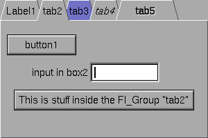
Tabbed container of widgets
Inherits from Group
| value |
The Tabs widget is the "file card tabs" interface that allows you to put lots and lots of buttons and switches in a panel, as popularized by many toolkits.

Clicking the tab makes a child visible (by calling show on it) and all other children are invisible (by calling hide on them). Usually the children are Group widgets containing several widgets themselves.
Each child makes a card, and it's label is printed on the card tab (including the label font and style). The color of that child is used to color the card as well. Currently this only draws nicely if you set the box property to the default Boxtype.thin_up or to Boxtype.flat, which gets rid of the edges drawn on the sides and bottom.
The size of the tabs is controlled by the bounding box of the children (there should be some space between the children and the edge of the Tabs), and the tabs may be placed "inverted" on the bottom, this is determined by which gap is larger. It is easiest to lay this out in the fluid UI designer, using the fluid browser to select each child group and resize them until the tabs look the way you want them to.
value is the currently visible child widget.